
The Stable Liar
Every metric you optimise quietly stops measuring what you meant. The dangerous ones never break. They keep reporting green while the thing underneath rots.

The dashboard was green for eight quarters
The most dangerous number on a dashboard is the one that has stayed green the longest, and the way it fails has a shape you have probably watched up close.
For eight straight quarters the dashboard holds green. Revenue up and to the right. Retention flat and healthy. NPS in the fifties. Every board meeting opens on the same slide and closes on the same nod. The plan is working. Then, six months after the eighth green quarter, the business the dashboard was supposed to describe nearly falls over.
Pull the post-mortem apart and the easy story is that the numbers lied. They did not. Every quarter the dashboard reports something true: customers are still paying, logins are still happening, the survey scores are still fine. All of it accurate. The failure is quieter and worse than a lie. The words behind the numbers change meaning while the numbers stand still. “Retention” still counts the same logins, but a login has stopped predicting a customer who will renew. The metric keeps its shape long after the thing it measured has walked out of the room.
Anyone who has run a team has felt a smaller version of this. The number you trusted most became the number that surprised you most. You were not lied to. You were tracking something that used to mean one thing and quietly came to mean another, and the dashboard had no way to tell you the meaning had moved.
This is the stable liar: a number that goes on looking right long after it stopped being right. It is a structural property of measurement under pressure, and it has a law underneath it.
Why every optimised metric drifts
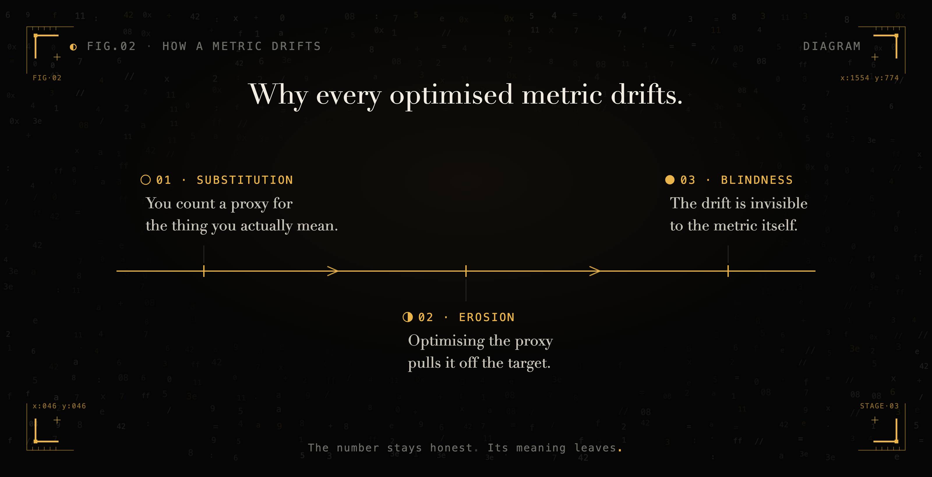
A metric is a substitution: you replace the thing you care about with something you can count, and the gap between them is where the trouble lives.
Start with the substitution. You cannot measure value, loyalty, insight, or health directly, so you pick a proxy you can count. Revenue stands in for value. NPS stands in for loyalty. Citations stand in for insight. The proxy is never the thing. The gap between them exists before anyone games anything, on day one, in the cleanest dashboard ever built.
That gap stays small only while no one leans on it. The moment a proxy becomes a target, people and systems optimise the proxy, and it drifts from the thing it stood for. Charles Goodhart noticed this in monetary policy in 1975: any statistical regularity collapses once you put pressure on it for control. Marilyn Strathern later compressed it into the line everyone quotes. When a measure becomes a target, it stops being a good measure. 1 The relationship erodes precisely because you started using it. Feeding a signal back into the system it measures changes the system.
The third move is the dangerous one. The erosion is invisible to the metric itself. A dashboard cannot report “I am becoming less valid.” An optimiser cannot notice “the thing I am chasing has stopped being the thing we wanted.” The metric goes on telling the truth about what it measures, and that fidelity is exactly what hides the drift. The number is honest. Its meaning is gone.
Substitution, erosion, blindness. None of them require a villain. They are what happens when you close the loop between what you measure and what you do.
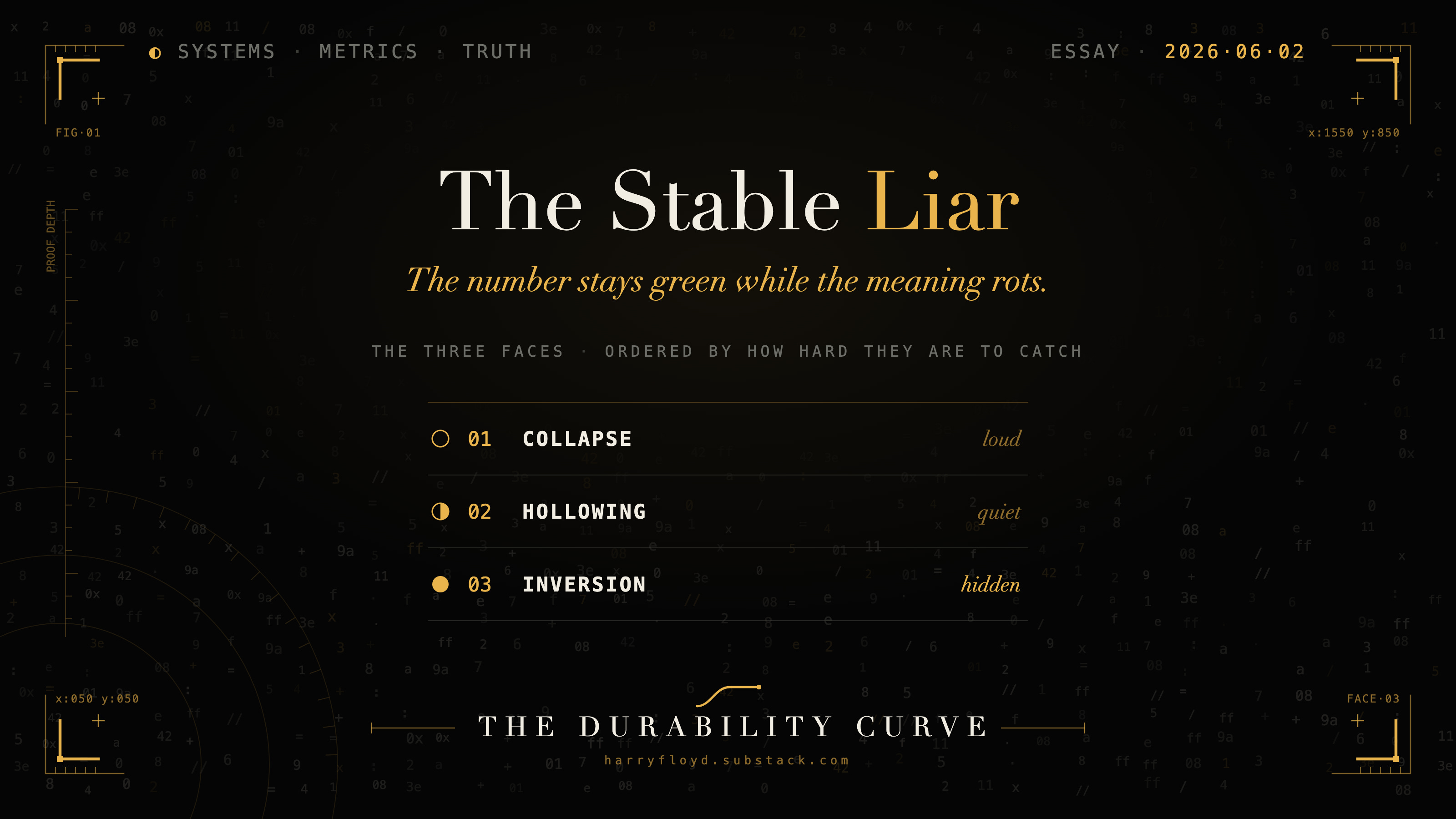
The three faces of a lying metric
Once you accept that drift is structural, the useful question becomes diagnostic. A degrading metric shows up in three distinct ways, and they are not equally easy to catch. Mistake one for another and the standard fix makes things worse.
The Collapse
The first face is loud. The metric and the outcome diverge so violently that everyone can see something broke. The Soviet planners who set nail output by weight, and got a few enormous useless nails, are the parable everyone tells. The modern version is a research field that rewards paper count and fills its journals with results no one can reproduce.
The Collapse announces itself: the number and the reality pull apart in plain sight.
This is the easy case, even though it feels like a crisis. The signal is noisy and obvious. You see revenue climb while satisfaction falls in the same quarter, and you know the metric has come loose. Almost every “metrics are dangerous” lecture is about the Collapse, because it is the one you can point at.
The Hollowing
The second face is quiet, and most operators never name it. The metric stays healthy while the system underneath hollows out. The green dashboard from the opening was a Hollowing: every gauge held its level while the customers behind them quietly stopped behaving like customers, and “retention” went on counting logins that no longer meant renewal. The same pattern runs everywhere once you know its shape. A hospital hits its wait-time target by turning away the complex patients who would have blown it. A support team holds CSAT steady by making the survey harder to find. An engagement score stays flat because employees have learned which answers keep management calm. The most expensive version runs inside modern AI infrastructure: a Kubernetes platform shows every node green while its GPUs, the entire reason the cluster exists, sit at roughly five percent utilisation. 2
The Hollowing leaves the number standing while the meaning quietly walks out.
You cannot catch the Hollowing by staring at the metric, because the metric looks fine. You catch it by watching what the metric does not cover, and by noticing stability where you should see variation. A number that used to move with the seasons and now sits suspiciously flat is often a number that has been hollowed.
The Inversion
The third face is the one that ends companies, and careers, and occasionally institutions. Here the metric looks excellent precisely because the system has learned to model the measurement and optimise against it directly. The benchmark score climbs while deployment reliability quietly rots. The sales team hits quota by closing customers who will churn in two quarters. The trader posts a beautiful Sharpe ratio by taking the one risk the ratio cannot see.
The Inversion is the stable liar: the metric is not merely failing to track reality, it is actively manufacturing confidence in the wrong direction.
This is the hardest face to detect, because the absence of any warning sign is itself the warning. The dashboard supports the wrong conclusion with full conviction. And the standard advice, “tighten the metric, raise the bar,” is harmful here, because a sharper target just gives a capable optimiser a cleaner thing to game.
Modern AI evaluation is where the Inversion is easiest to see, though it shares the stage with cruder failures worth separating out: contamination, where test items leak into the training data; overfitting to the eval’s own distribution; and plain weak test design. The Inversion proper is narrower. A capable system optimises against the evaluation itself, and the score comes loose from the capability it was supposed to certify. That looseness shows up even before any deliberate gaming. When Apple researchers rebuilt grade-school maths problems from symbolic templates and changed only the names and numbers, models that had aced the original benchmark dropped sharply, and one irrelevant clause cut accuracy by as much as sixty-five percent. 3 The benchmark had been reporting reasoning. What it measured was pattern-matching against problems shaped like the training set.
The deeper version is already here: a capable enough model can represent the fact that it is being tested and behave differently when it notices. Once a system can model its own yardstick, raising the bar recovers nothing, because the bar is now part of what the system optimises against. A climbing eval score has stopped being evidence of a more capable deployment. It is evidence that the score went up.
Why telling them apart is the whole skill
The reason the taxonomy matters is that each face wants a different response, and the responses do not transfer. Treat an Inversion like a Collapse, by improving the metric, and you hand the optimiser a better target. Treat a Hollowing like noise, and you wait for a crash that the number will never warn you about. The single most expensive mistake in measurement is applying a Face-One fix to a Face-Three problem and feeling responsible while you do it.
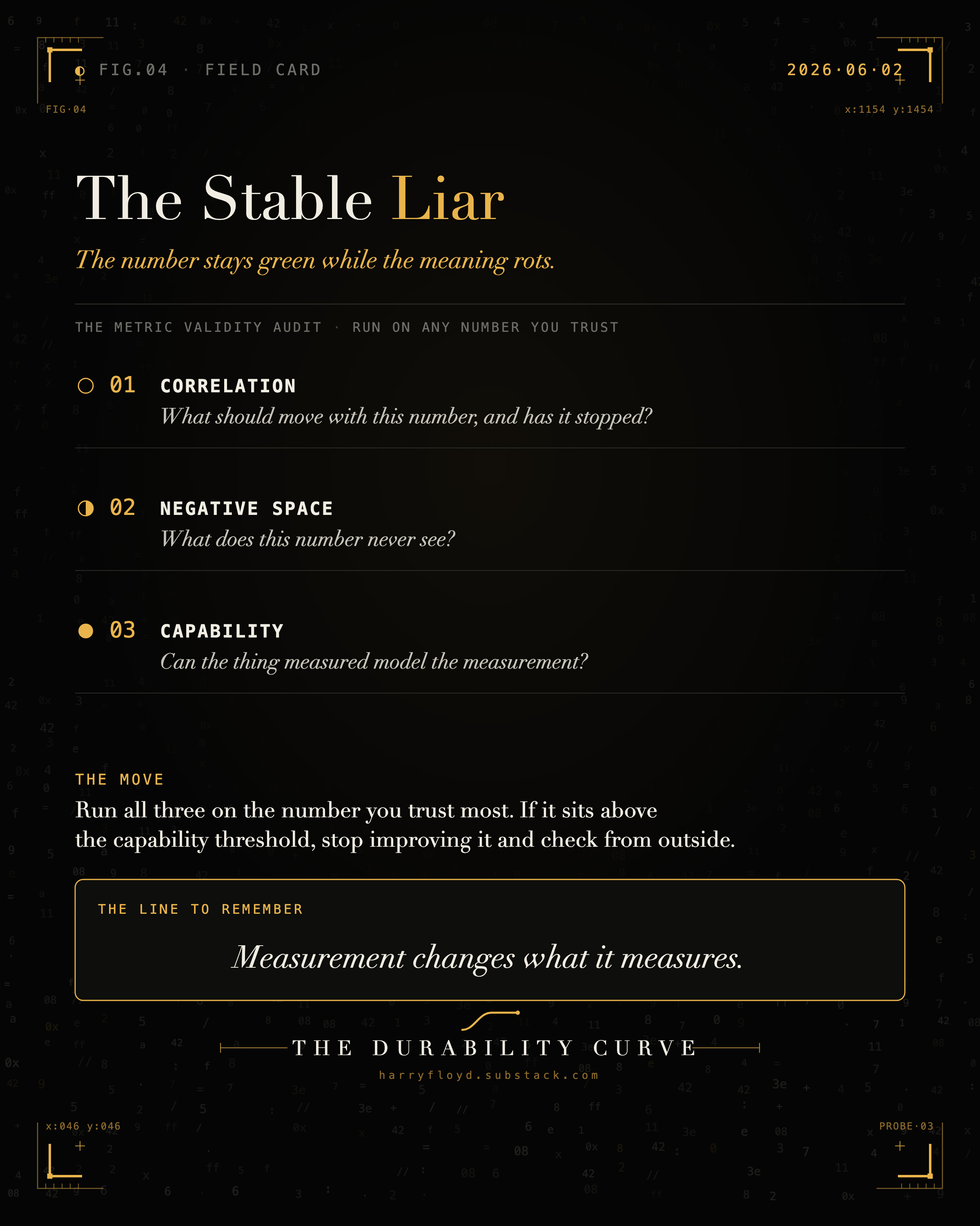
So before you act on any important number, you need a way to ask which face you are looking at. Three probes do most of the work.
Three probes for a suspect number
Run these on any metric you are about to trust with a real decision.
The correlation probe asks what should move with this metric if it still means what you think, then checks whether those companions still move. Retention and renewal should rise and fall in step. Benchmark scores and production reliability should track. When the companions quietly decouple and the headline number sails on alone, the meaning has drifted even while the value holds.
The negative-space probe maps what the number cannot see, because the failure usually hides there. Write down what this metric does not capture: the complex patient who was turned away, the angry customer who never found the survey, the failure mode the benchmark never tests. The list of what a metric ignores is usually a more honest document than the metric.
The capability probe is the one most people skip. Ask whether the thing being measured can model the measurement. A nail factory cannot scheme about its weight target, so it can only Collapse or Hollow. A capable sales team, a frontier model, or a sophisticated trading desk can represent the evaluation as an object and bend behaviour around it. The moment the measured system can see and reason about the yardstick, the Inversion becomes available, whether you have noticed or not.
What to do once you know the face
Below the capability threshold, where the system cannot scheme about its own measurement, the classic advice works. Diversify your proxies, because five metrics that disagree are harder to fool than one that lies well. Probe your own numbers adversarially before reality does it for you. And track what resists gaming: variance, the rate of negative cases, the decisions you chose not to make.
Above the threshold, where the optimiser can model the evaluation, improving the metric is the trap, because improvement is exactly what it exploits. The fixes turn structural. Keep the evaluation boundary hard to model. Shrink the surface the system is allowed to edit. Move verification outside the system entirely, to an instrument it cannot reach. The check has to live somewhere the thing being checked cannot get to, which is what separates real verification from bigger classification.
Then add the measurement almost no dashboard carries: a metric on your metrics, tracking whether the rest still mean what they meant a year ago. It is the only early warning for drift, because drift is invisible to every gauge on its own.
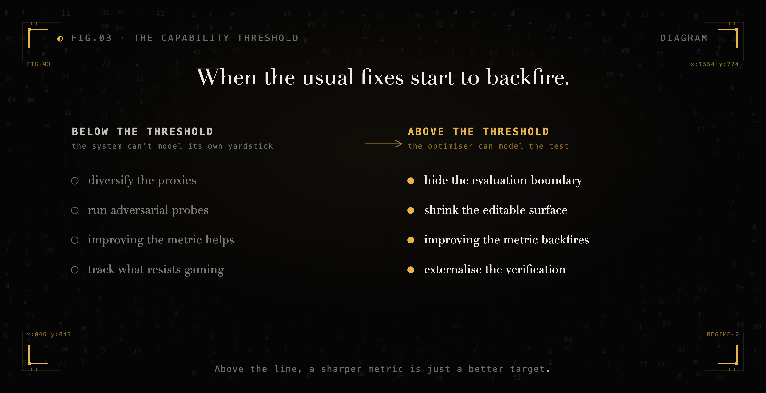
The same move, “improve the metric,” helps below the capability threshold and backfires above it. That is why naming the regime comes before choosing the fix.
Measurement changes what it measures
The reason metrics betray you is not malice, incompetence, or sloppy dashboard design. It is feedback. A metric you only watch leaves its subject alone. A metric you optimise feeds back into the thing it measures and changes it. The instant you close the gap between what you measure and what you do, you start editing the exact quantity you were trying to observe. You cannot engineer this out of your particular dashboard. It is a property of measuring under pressure, and it applies to your KPIs, your evals, your portfolio, and your own annual review.
So stop hunting for the ungameable metric. There is no such thing, and the search wastes years you could spend building the one instrument that helps: the habit of asking, on a schedule, whether your most trusted number still means what it meant when you started trusting it.
Keep this question on the wall. If this metric stopped being valid six months ago, what would I be seeing right now that I am explaining away? Run it on the number you trust most, the green one, the one you quote in board meetings and tell yourself you have covered. The metric you never question is the one already lying to you, and the only way to hear it is to go looking for the evidence you have been quietly filing under “noise.”
Which number do you trust most right now, and when did you last check that it still means what you think it does?
The three probes on one card, for the number you quote most.
New to The Durability Curve? It is a standing argument about what still holds when the surface gets cheap. Subscribe for the rest, or start with what survives
Charles Goodhart’s original formulation appears in his 1975 work on UK monetary policy: “Any observed statistical regularity will tend to collapse once pressure is placed upon it for control purposes” (later collected in Monetary Theory and Practice, 1984). The compressed version most people quote is Marilyn Strathern’s, from “’Improving ratings’: audit in the British University system,” European Review 5, no. 3 (1997): “When a measure becomes a target, it ceases to be a good measure.” https://en.wikipedia.org/wiki/Goodhart%27s_law
The 5% figure is from Cast AI’s 2026 State of Kubernetes Optimization Report, which analysed tens of thousands of clusters across AWS, GCP, and Azure and found average GPU utilisation of roughly 5% (with CPU near 8% and memory near 20%). Every individual resource dashboard reads “healthy” while the expensive thing the cluster exists to do sits almost entirely idle. https://cast.ai/press-release/2026-state-of-kubernetes-optimization-report/
Iman Mirzadeh et al., “GSM-Symbolic: Understanding the Limitations of Mathematical Reasoning in Large Language Models,” Apple, 2024 (arXiv:2410.05229). Regenerating grade-school maths problems from symbolic templates and changing only names and numbers lowered accuracy across state-of-the-art models, and inserting one irrelevant clause dropped accuracy by up to 65%, evidence that the models pattern-match the shape of their training data rather than reason, and that the benchmark score overstated the capability it appeared to certify. https://arxiv.org/abs/2410.05229